Here's something that's been nagging at me. Grocery delivery apps have been around for years now, and yet every time I use one, I find myself doing mental maths right until the final checkout screen. Why is it so hard to know what I'm actually going to pay?
Instacart is the dominant player in US grocery delivery. They've got the partnerships, the scale, the brand recognition. But when I talk to people about their experience with the app, the same complaints keep surfacing: it feels busy. It feels pushy. The final price is never what you expected.
So I ran a study with 6 US grocery delivery users to dig into what's actually happening. The participants ranged from a 15-year-old high school student in Michigan to an 81-year-old retiree in Kentucky. We had bilingual speakers, people on low-bandwidth connections, and users with accessibility needs. The diversity was intentional, because if an app works for everyone, it works.
The Participants
The study included six participants with deliberately varied backgrounds. Ages ranged from 15 to 81. Locations spanned Rochester (New York), Owensboro (Kentucky), Yonkers (New York), Warren (Michigan), rural Maryland, and rural North Carolina. Income levels covered everything from a teenager's part-time earnings to a retiree's comfortable $120k. This wasn't a homogeneous focus group of urban millennials. This was America, in all its complicated, diverse reality.
What united them? They all use grocery delivery apps. They all have opinions. And Jaysus, did they have things to say.
The App Feels "Busy and a Little Pushy"
This phrase came up repeatedly. Users described an experience of visual clutter: membership pop-ups, trial banners, coupon overlays, and endless nudges to add more items. For older users, the small text and low contrast made navigation genuinely difficult. For younger users on mobile data, the heavy images consumed bandwidth they couldn't spare.
The word cloud from our analysis tells the story. The most mentioned terms were: fees (24 mentions), clear (23), price (23), total (21). People are thinking about money. They're thinking about transparency. And they're not finding it.
Key insight: The visual noise isn't just annoying. It's eroding trust. When users feel they're being sold to at every turn, they start questioning whether the app has their interests at heart.
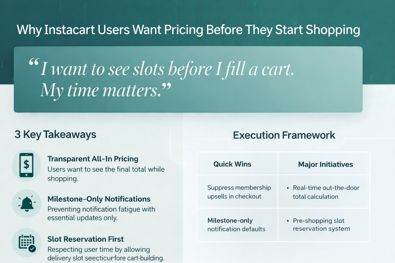
"The Total Keeps Jumping as Small Fees Load In"
This was the single biggest pain point across every participant. The out-the-door price is hidden until the very end. Service fees, delivery fees, tips, taxes: they all appear late in the checkout flow, turning a $45 basket into a $62 order.
One participant put it perfectly:
"I want to see slots before I fill a cart. My time matters."
That quote stopped me cold. This user isn't just asking for price transparency. They're asking for respect for their time. Why should someone spend 20 minutes filling a cart only to discover that no delivery slots work for their schedule? Or that the total is way beyond their budget?
The fix is fierce obvious: show an estimated total while shopping, including fees and taxes. Let users reserve a delivery slot before they start shopping. These aren't revolutionary ideas. They're basic courtesy.
Key insight: Late disclosure of fees doesn't just annoy users. It kills checkout conversion. When the total jumps at the final screen, people abandon their carts.
Real-Time Tracking: Wanted, But Not Like This
Here's where the research got fierce interesting. Users want to know when their shopper has started, when there's a substitution, and when the delivery is on its way. What they don't want is a play-by-play.
One participant summed it up brilliantly:
"If it turns into a steady drip of dings, I will shut it off."
The consensus was clear: milestone-only notifications. Tell me when it matters. Don't ping me for every aisle my shopper walks down. And for the love of all that's holy, don't use the chat to upsell me or nudge me about tips.
Users also had strong feelings about privacy. Masked phone numbers and ephemeral chat were preferred. Photo proof of delivery was nearly universal: people want to see that their groceries made it to the right door. But they don't want the shopper to have their personal mobile number.
Key insight: Over-communication is just as damaging as under-communication. Users will disable notifications entirely if they feel bombarded, which means they miss the updates that actually matter.
The Store Selection Problem
Multiple participants mentioned that store selection is "tucked up top" and confusing. The result? Accidental cross-store behaviour that breaks price stability and erodes trust.
Here's the scenario: you think you're shopping at Costco, but somehow an item from Safeway ends up in your cart. Now you've got split orders, different delivery windows, and a total that makes no sense. It's the kind of friction that makes users question whether the app is working for them or against them.
The fix is straightforward: lock the active store once a user starts shopping. Add guardrails that warn before cross-store adds. Make it blindingly obvious which store you're currently in.
Key insight: A confused user is a frustrated user. Store-switching UX needs to be explicit and intentional, not something that happens by accident.
Substitutions: The Hidden UX Battle
Every grocery delivery user has a substitution horror story. You ordered organic bananas, you got plantains. You wanted 1% milk, you got whole. The current substitution workflow buries the price differences and makes it hard to approve or reject quickly.
Users want one-tap substitution approvals with visible price deltas. They want photos of the actual options available. And they want to set per-item rules that persist: "Always substitute brand X for brand Y, never substitute anything for my coffee."
The research suggested that a 70%+ one-tap approval rate is achievable if price deltas are visible. That's a significant improvement over the current friction.
Key insight: Substitutions are where the app's promise meets reality. Get this wrong, and you've broken trust. Get it right, and you've created a moment of genuine service.
How Instacart Stacks Up Against Competitors
The competitive landscape is fierce clear from the research:
DoorDash wins for quick 5-item emergency runs. It's fast, but limited selection.
Walmart wins on lowest basket price, but has "clunkier" substitution controls.
Amazon Fresh has membership friction that deters adoption.
So where can Instacart win? The research points to a clear path: transparent all-in pricing, reservable delivery windows, a calm UX, strong accessibility, bilingual support, and fast refunds. These aren't sexy features. They're trust builders.
Key insight: Instacart's competitive advantage isn't speed or price. It's the potential to be the most trustworthy, transparent option. That's a positioning that's currently unclaimed.
What This Means for Grocery Delivery Apps
The research points to several actionable recommendations:
Show the out-the-door total while shopping, including fees, taxes, and estimated tip. No more checkout surprises.
Let users reserve delivery slots before filling their cart. Respect their time. This single change could dramatically improve completion rates.
Default to milestone-only notifications. Tell users when their order is started, when there's a substitution needed, when it's on the way, and when it's delivered. That's it.
Suppress membership upsells in checkout and chat. The final stages of a transaction are not the time to push add-ons.
Build substitution workflows that make sense. One-tap approvals, visible price deltas, photos, saved rules. This is where trust is built or broken.
Create a low-data, high-accessibility mode. Compressed images, text-first lists, large buttons, EN/ES prompts. This isn't a nice-to-have. It's serving real customers who currently struggle with the app.
The Bottom Line
Grocery delivery isn't a new category anymore. Users have expectations. They've been burned by surprise fees and notification spam. They know what good service looks like because they've experienced it elsewhere.
The opportunity for Instacart, and honestly for any grocery delivery app, is to be the one that respects users' time, money, and attention. Show the real price. Let them plan their delivery. Don't bombard them with notifications. Make substitutions painless.
It's not complicated. It's just good product.
About This Study
This research was conducted using Ditto's synthetic market research platform. Six synthetic personas representing diverse US grocery delivery users participated, answering questions about app UX, real-time communication preferences, and competitive positioning. The study intentionally included participants with accessibility needs, bilingual backgrounds, and varied income levels to ensure findings applied broadly across the US market.
Want to test your own app experience or product positioning? Ditto lets you run studies like this in hours, not weeks. Book a demo at askditto.io.